
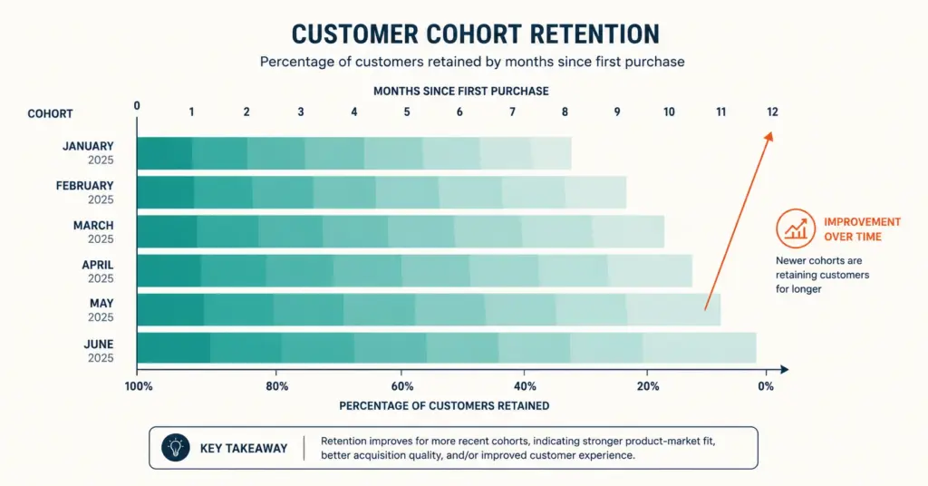
- Cohort analysis groups customers by a shared characteristic (usually acquisition month) and tracks their behavior over time. Unlike blended averages that mix old and new customers, cohort analysis reveals whether each group of customers is getting better or worse, which is the most honest measure of business health.
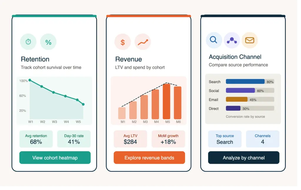
- The 3 cohort types for ecommerce: retention cohorts (what % of each month's new customers repurchase), revenue cohorts (how much each month's customers spend over time), and acquisition cohorts (which channels produce the most valuable long-term customers).
- The pattern to watch: if January's cohort retained 30% at 6 months and June's cohort retains 25% at 6 months, your business is deteriorating even if blended revenue is growing. Cohort analysis reveals this; monthly revenue reports don't.
- Most ecommerce businesses don't need complex cohort tools. Shopify's built-in cohort reports, Klaviyo's customer analytics, and a simple spreadsheet cover 90% of cohort analysis needs for stores under $5M annual revenue.
Cohort analysis is the practice of grouping customers by a shared characteristic, most commonly the month they made their first purchase, and tracking how each group behaves over subsequent months. Instead of asking “what’s our repeat purchase rate?” (a blended average that mixes loyal 2-year customers with yesterday’s first-time buyer), cohort analysis asks “what percentage of January 2026 first-time buyers made a second purchase within 3 months?” The answer reveals whether customer quality is improving, stable, or declining over time, which blended metrics cannot show. According to Amplitude’s analytics research, cohort analysis is the most reliable predictor of long-term business health because it isolates trends from noise.
Blended averages are dangerous because growth masks deterioration. A store growing 30% annually can simultaneously have declining retention, declining average order value, and declining customer quality, all hidden by the volume of new customers entering the top of the funnel. Cohort analysis strips away the growth illusion and shows whether the underlying business is getting stronger or weaker. For the LTV metric that cohort analysis directly informs, see our lifetime value calculation guide.
What Are the 3 Types of Ecommerce Cohort Analysis?
1. Retention cohorts
The most important cohort type for ecommerce. Retention cohorts track what percentage of each month’s new customers make a repeat purchase in subsequent months.
| Cohort | Month 1 | Month 3 | Month 6 | Month 12 |
|---|---|---|---|---|
| Jan 2026 (500 new) | 100% | 22% | 15% | 10% |
| Feb 2026 (600 new) | 100% | 25% | 18% | — |
| Mar 2026 (550 new) | 100% | 28% | — | — |
| Apr 2026 (700 new) | 100% | 30% | — | — |
Reading this table: the April cohort’s 30% 3-month retention is better than January’s 22%. Retention is improving. This trend is invisible in blended metrics but critical for business direction. For retention improvement tactics, see our customer retention guide.
2. Revenue cohorts
Revenue cohorts track cumulative spending per customer for each acquisition month. This reveals whether newer customers are spending more or less than earlier customers at the same point in their lifecycle.
| Cohort | Month 1 Revenue/Customer | Month 3 Cumulative | Month 6 Cumulative |
|---|---|---|---|
| Jan 2026 | $52 | $68 | $85 |
| Feb 2026 | $55 | $74 | — |
| Mar 2026 | $58 | $80 | — |
March customers are spending more at the same lifecycle stage ($80 at 3 months vs $68 for January). This indicates improving product, pricing, or cross-sell effectiveness. Revenue cohorts reveal LTV trajectory before you have enough history for traditional LTV calculation. For CAC evaluation against cohort-level LTV, see our customer acquisition cost guide.
3. Acquisition channel cohorts
Compare customer quality by acquisition source. Do Meta-acquired customers retain better than Google-acquired? Do organic search customers spend more than paid search customers?
| Channel | Avg First Order | 6-Month Retention | 6-Month Revenue/Customer |
|---|---|---|---|
| Organic search | $58 | 22% | $95 |
| Meta Ads | $48 | 15% | $68 |
| Email referral | $62 | 28% | $110 |
| TikTok Ads | $42 | 12% | $55 |
Email-referred customers produce 2x the 6-month value of TikTok customers. This data should influence budget allocation: invest more in channels that produce higher-LTV customers, not just lower-CPA customers. For attribution methodology that feeds channel cohort data, see our attribution modeling guide.
How Do I Set Up Cohort Analysis?
The simple spreadsheet method
- Export customer data: From Shopify (Customers > Export), pull: customer email, first order date, all order dates, and order totals.
- Assign cohort month: Group each customer by the month of their first order (January cohort, February cohort, etc.).
- Track subsequent activity: For each cohort, count how many customers repurchased in month 2, month 3, month 6, month 12.
- Calculate retention rates: Repurchasers in month N / total cohort size x 100 = retention rate for that cohort at month N.
- Compare across cohorts: Are newer cohorts retaining better than older ones at the same lifecycle stage?
Platform-based cohort tools
| Tool | Cohort Capability | Cost |
|---|---|---|
| Shopify Analytics | Built-in retention and revenue cohort reports | Included |
| GA4 Cohort Exploration | User retention, revenue, and engagement cohorts | Free |
| Klaviyo Customer Analytics | Purchase behavior cohorts by segment | Included with Klaviyo |
| Lifetimely (Shopify app) | LTV-focused cohort analysis with visualizations | $19 to $149/month |
| Triple Whale | Channel-attributed cohort analysis | $100+/month |
Start with Shopify’s built-in cohort reports (Analytics > Reports > Returning customer rate). Graduate to Lifetimely or Triple Whale when you need channel-level cohort attribution or predictive LTV by cohort. For broader analytics setup, see our GA4 ecommerce setup guide.
What Patterns Should I Look For in Cohort Data?
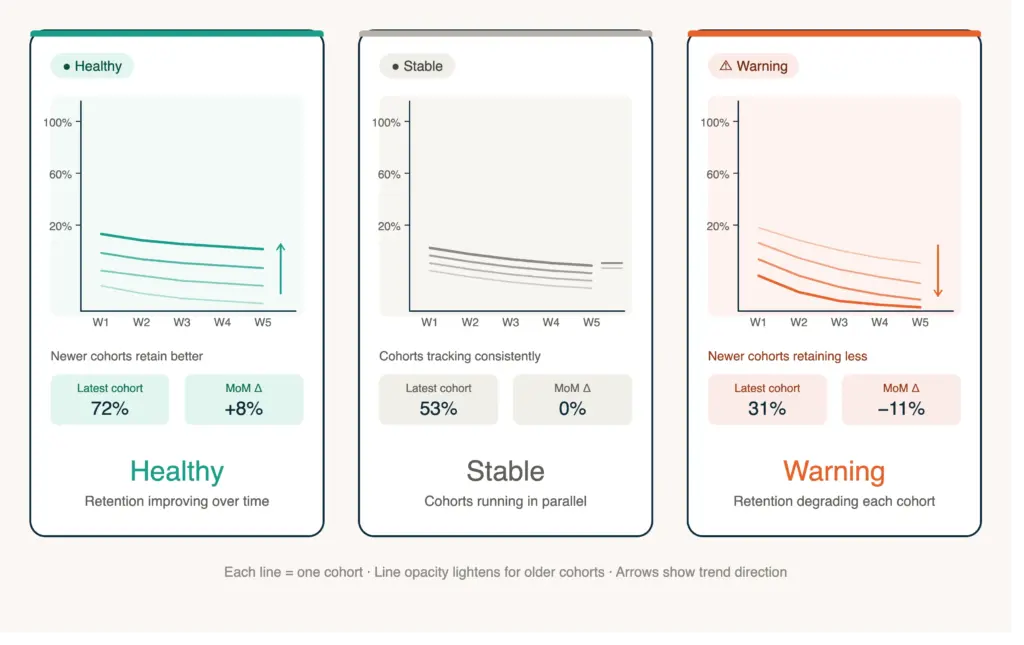
Improving retention curves (healthy)
Each new monthly cohort retains better at the same lifecycle stage than the previous month’s cohort. This indicates: product quality is improving, onboarding and post-purchase flows are more effective, or customer targeting is attracting better-fit buyers. Continue investing in whatever changed.
Declining retention curves (warning)
Each new cohort retains worse. This indicates: product quality issues, increased price sensitivity in newer customer segments, or marketing attracting lower-intent buyers (common when scaling paid ads aggressively). Investigate immediately. The impact compounds: declining cohort retention today means significantly lower revenue 6 to 12 months from now. For scaling considerations, see our financial planning guide.
Flat retention with growing AOV (good)
Same percentage of customers return, but each cohort spends more per order. This indicates effective upselling, cross-selling, or pricing strategy. The business is extracting more value from the same retention rate. For AOV tactics, see our upsell and cross-sell guide.
The “month 2 cliff”
Most ecommerce brands see a dramatic drop between month 1 (100% by definition) and month 2 (typically 15 to 30% repurchase). This cliff is normal. The actionable insight is whether the cliff is getting shallower (improving) or steeper (worsening) across cohorts. A cliff from 100% to 30% is significantly better than 100% to 15%. Post-purchase email and SMS flows directly influence the month 2 number. For email automation, see our email marketing strategy guide.
How Do I Use Cohort Data for Business Decisions?
Budget allocation
Channel cohort data reveals which acquisition sources produce customers worth investing in long-term. If organic search customers have 2x the 12-month LTV of paid social customers, the higher upfront cost of SEO and content marketing is justified. Reallocate 10 to 20% of paid social budget to content if cohort data consistently shows organic superiority. For content strategy, see our content marketing guide.
Product development
If cohort retention improved after launching a new product line or improving an existing product, quantify the impact: “March cohort retention is 5 points higher than February, coinciding with the reformulated product launch.” This justifies further product investment. For product page impact, see our product page design guide.
Retention investment
Cohort analysis shows the precise dollar value of retention improvement. If improving month-3 retention from 20% to 25% on a 500-customer cohort with $60 AOV produces 25 additional repeat purchases ($1,500), you know exactly how much to invest in retention programs. For retention tactics, see our customer retention guide.
Forecasting
Cohort curves predict future revenue with more accuracy than trend-line extrapolation. If your average cohort reaches $90 cumulative revenue by month 6, and you acquired 500 customers last month, you can forecast approximately $45,000 in cumulative revenue from that cohort over 6 months. For KPI tracking, see our ecommerce KPIs guide. For ROAS assessment, see our ROAS benchmarks guide.
Common Cohort Analysis Mistakes
Comparing cohorts at different lifecycle stages
Comparing January’s 12-month retention to June’s 3-month retention is meaningless. Always compare cohorts at the same lifecycle stage: January 3-month vs June 3-month. This requires patience because newer cohorts need time to mature before comparison. According to Reforge’s growth accounting framework, premature cohort comparison leads to false conclusions about improvement or deterioration that mislead strategic decisions.
Ignoring cohort size differences
A month where you acquired 100 customers and a month where you acquired 1,000 customers produce cohorts with different statistical reliability. Small cohorts have more variance. Weight cohort insights by size when making decisions. A retention improvement from 20% to 25% on a 1,000-customer cohort is more reliable than 20% to 30% on a 100-customer cohort.
Not acting on declining cohorts
Seeing retention decline across cohorts and continuing business as usual is the costliest mistake. Declining cohorts compound: today’s lower retention means less repeat revenue 6 months from now, which means you need more (and more expensive) new customer acquisition to maintain revenue. Investigate and address the root cause (product quality, targeting drift, competitive pressure) immediately. For margin protection, see our ecommerce profit margins guide.
Over-analyzing without minimum data
Cohort analysis requires at least 6 months of data and 200+ customers per cohort to produce reliable patterns. Below these thresholds, random variation dominates and you’ll draw false conclusions. Start tracking cohorts now but wait for sufficient data before making major strategic changes based on cohort trends. Patience with data collection pays off through more reliable insights. For tracking foundation, see our tracking setup guide.
Frequently Asked Questions
Cohort analysis groups customers by a shared characteristic (usually the month of their first purchase) and tracks behavior over time. Instead of blended averages that mix old and new customers, cohort analysis shows whether each customer group is getting better or worse. This reveals trends invisible in standard reports: improving retention, declining order values, or channel quality differences across acquisition periods.
Blended metrics hide deterioration behind growth. A store growing 30% annually can simultaneously have declining customer retention, declining order values, and declining acquisition quality, all masked by new customer volume. Cohort analysis strips away the growth illusion and shows whether the underlying business is strengthening or weakening. It’s the most honest measure of business health and the best predictor of future performance.
Start with Shopify’s built-in cohort reports (Analytics > Reports > Returning customer rate). For manual analysis: export customer data, group by first-purchase month, count repurchasers in subsequent months, and calculate retention rates per cohort. Compare newer cohorts to older ones at the same lifecycle stage. Graduate to Lifetimely ($19/month) or Triple Whale ($100/month) for automated cohort visualizations and channel attribution.
Benchmarks vary by category: beauty and supplements (consumables) target 25 to 35% 3-month retention. Fashion targets 15 to 25%. Electronics targets 10 to 20%. Home goods target 12 to 18%. More important than the absolute rate is the trend: is retention improving across cohorts? A store with 18% retention that improves to 22% over 6 months is healthier than one with stable 25% retention and declining trajectory.
Minimum: 6 months of order data and 200+ customers per monthly cohort. Below these thresholds, random variation dominates and trends are unreliable. Start tracking cohorts immediately but wait for sufficient data before making major strategic changes. At 500+ customers per cohort with 12+ months of data, cohort patterns become highly reliable for business decision-making.
Monthly review is sufficient because cohort data changes slowly (it’s a lagging indicator). Each month, compare the newest cohort’s early metrics to the same lifecycle stage of previous cohorts. Quarterly, do a deeper analysis comparing 6-month and 12-month retention across all cohorts. Annual reviews should assess overall trajectory and inform strategic planning for acquisition, retention, and product investment.
Related Reads
- Lifetime Value Calculation
- Customer Acquisition Cost
- Ecommerce KPIs Guide
- Attribution Modeling
- Customer Retention Guide
- Customer Segmentation Guide
Enjoying this? Get more like it every week.
One email per week with ecommerce strategies, tool picks, and seller insights. No spam.