- Your product page is your online salesperson. It has to do in seconds what a retail associate does in minutes: show the product clearly, answer objections, build trust, and make buying effortless. The average ecommerce conversion rate is 2-3%. Top-performing product pages hit 5-8%.
- The seven non-negotiable elements: high-quality images (5-8 per product), benefit-driven description, clear pricing with shipping info, prominent CTA button, customer reviews, trust signals (returns policy, security badges), and mobile-first layout.
- Most product pages fail because they describe features instead of benefits, show too few images, bury the Add to Cart button below the fold, or hide shipping costs until checkout. Each of these issues directly reduces conversion rate.
- Design patterns matter: the image should occupy 50-60% of above-fold space on desktop, the CTA button must be visible without scrolling on both desktop and mobile, and the price should sit within 200 pixels of the Add to Cart button.
Ecommerce product page design is the strategic arrangement of images, copy, pricing, calls to action, trust signals, and technical elements on the page where a customer decides whether to buy your product or leave your store. It’s the single highest-impact page on your entire site because every marketing dollar you spend, whether on ads, SEO, or social media, eventually funnels visitors to this page where the conversion either happens or doesn’t.
The average ecommerce conversion rate hovers around 2-3%. That means 97 out of 100 visitors leave without buying. The difference between a 2% and 5% conversion rate on the same traffic is a 150% revenue increase without spending an extra dollar on marketing. Product page optimization is the cheapest way to grow revenue because you’re improving what you already have rather than paying for more traffic.
This guide breaks down every element of a high converting product page, why it matters, and how to implement it. If you’re still setting up your store, our store launch checklist covers the full setup process, and our web design guide handles site-wide design decisions.
The 7 Non-Negotiable Product Page Elements
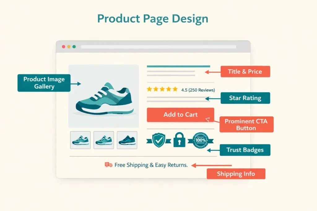
1. Product Images (5-8 Per Product Minimum)
Images are the most influential element on any product page. Online shoppers can’t touch, hold, or try your product. Your photos have to replace that entire sensory experience. Listings with 5+ images convert at significantly higher rates than those with 1-2.
Your image set should include:
- Hero image: Clean, well-lit product on white or neutral background. This is the thumbnail shoppers see in search results and category pages.
- Multiple angles: Front, back, side, top, and detail shots. Leave no visual question unanswered.
- Scale reference: Product next to a common object or on a model to show actual size. “How big is it?” is the question images answer better than dimensions text.
- Lifestyle/context images: Product in use, in a real setting. A lamp on a white background shows you a lamp. A lamp on a nightstand in a styled bedroom sells you a feeling.
- Detail/texture shots: Close-up of materials, stitching, controls, or unique features. These build quality perception that justifies pricing.
- Infographic images: Annotated photos highlighting key features, dimensions, or included accessories. These combine visual appeal with informational density.
Technical requirements: minimum 1000×1000 pixels (2000×2000 for zoom functionality), consistent aspect ratio across all products, compressed for fast loading (WebP format preferred, test with PageSpeed Insights), and descriptive alt text for SEO.
2. Product Title and Description
The title identifies what the product is. The description sells why the customer should buy it. Most product pages fail here by listing specs instead of communicating value.
Title formula: Brand + Product Type + Key Differentiator + Variant Info. “Oakridge Organic Cotton Crew Neck T-Shirt | Preshrunk | 12 Colors” tells the shopper everything at a glance.
Description framework (lead with benefits, support with features):
- Opening line: What problem does this product solve or what experience does it deliver? “Finally, a t-shirt that stays soft wash after wash without shrinking.”
- 3-5 benefit bullets: Each starts with what the customer GETS, not what the product HAS. “Stays true to size through 50+ washes” beats “100% preshrunk organic cotton.”
- Specs section: Material, dimensions, weight, care instructions, compatibility. For shoppers who want data after being sold on benefits.
- Use case or styling suggestion: “Pairs with everything from jeans to blazers for effortless versatile style.”
3. Pricing and Shipping Transparency
The price must be immediately visible, not something the buyer hunts for. Display it within 200 pixels of the Add to Cart button. If you offer a discount, show both the original price (struck through) and the sale price with the savings amount or percentage.
Critical: Show shipping cost or free shipping messaging on the product page. “Free shipping on orders over $50” or “Flat rate $4.99 shipping” prevents the sticker shock at checkout that causes 48% of cart abandonment. If exact shipping costs depend on location, add a shipping calculator above the fold.
4. Call to Action (Add to Cart Button)
The CTA button is the conversion point. Every other element on the page exists to get the visitor to click this button. Product page best practices for CTAs:
- Color contrast: The button must visually pop against the page background. If your site is blue-themed, an orange or green CTA stands out.
- Size: Large enough to tap easily on mobile (minimum 48×48 pixels, preferably larger)
- Position: Visible without scrolling on both desktop and mobile. If the user has to scroll to find the buy button, you’re losing sales.
- Copy: “Add to Cart” is standard. “Buy Now” creates more urgency. Test both. Avoid vague text like “Continue” or “Submit.”
- Sticky CTA on mobile: A fixed Add to Cart bar at the bottom of the screen that stays visible as the user scrolls through images and description.
5. Customer Reviews and Ratings
92% of consumers read online reviews before purchasing according to PowerReviews research. Reviews on the product page provide social proof that no amount of marketing copy can replicate. Display:
- Star rating summary near the product title (with count: “4.7 out of 5 based on 234 reviews”)
- Full review section below the description with photos and verified purchase badges
- Review highlights or quotes pulled from the most helpful reviews
No reviews yet? Show the review section anyway with a “Be the first to review” prompt. An empty review section is better than no review section because it signals that reviews are coming. Our retention guide covers automated review collection strategies.
6. Trust Signals
First-time visitors to your store don’t trust you yet. Trust signals reduce the perceived risk of buying from an unknown brand:
- Return policy summary: “30-day hassle-free returns” displayed near the CTA, not buried in a footer link
- Security badges: SSL lock, payment processor logos (Visa, Mastercard, PayPal, Apple Pay)
- Shipping guarantee: “Ships within 24 hours” or “Arrives by [date]”
- Money-back guarantee badge: If you offer one, make it prominent
- Social proof numbers: “5,000+ happy customers” or “Rated 4.8/5 by 500+ buyers”
7. Mobile-First Layout
Over 60% of ecommerce traffic is mobile. Your product page layout ecommerce must work perfectly on a 5-inch screen. Mobile priorities:
- Images render full-width with swipe navigation between photos
- Product title, price, and CTA visible within the first screen (no scrolling to find the buy button)
- Variant selectors (size, color) are large tap targets, not tiny dropdown menus
- Description collapses into expandable sections to save scroll depth
- Sticky Add to Cart bar follows the user as they scroll
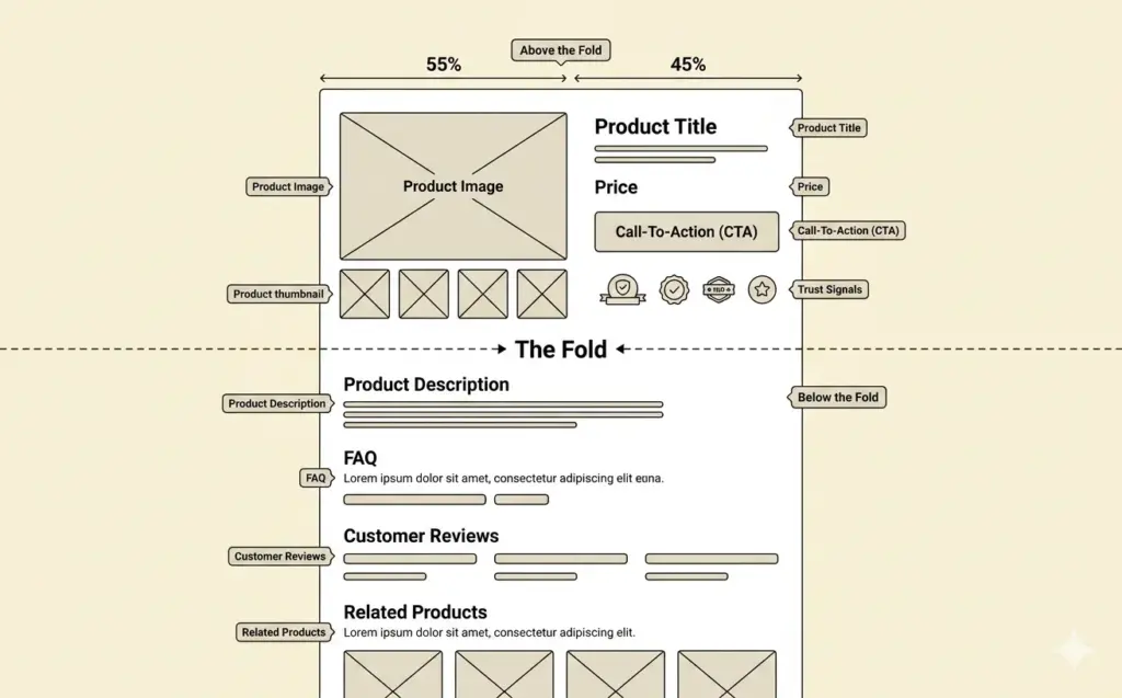
Above the Fold: What Must Be Visible Immediately
The “above the fold” zone (what’s visible without scrolling) determines whether a visitor engages or bounces. On a high converting product page, the above-fold area contains:
Desktop layout: Product image gallery (left, 50-60% width) + product title, price, variant selectors, CTA button, and shipping info (right, 40-50% width). Reviews summary sits just below the title.
Mobile layout: Full-width image carousel → product title → price → variant selector → Add to Cart button. All within one scroll or less. Everything else (description, reviews, specs) lives below.
The rule: a visitor should be able to identify the product, see the price, and click “Add to Cart” without scrolling. If any of those three require scrolling, your above-fold design needs work.
Below the Fold: Supporting Content That Closes Objections
Buyers who scroll past the fold are interested but not yet convinced. Below-fold content handles objections:
Detailed description with benefits. The expanded product story, use cases, and feature breakdown for shoppers who want more information before committing.
FAQ section. Address the 3-5 most common questions about the product: sizing, compatibility, care instructions, warranty, return process. Every unanswered question is a reason to not buy.
Related and complementary products. “Customers also bought” and “Complete the look” sections increase average order value by 10-30% while helping shoppers discover products they didn’t know they needed. Our pricing strategy guide covers bundling and AOV optimization.
Full reviews section. Sortable by rating, filterable by verified purchase, with photo/video reviews prominently displayed. Negative reviews (with your professional responses) actually build more trust than a wall of 5-star reviews because they demonstrate authenticity.
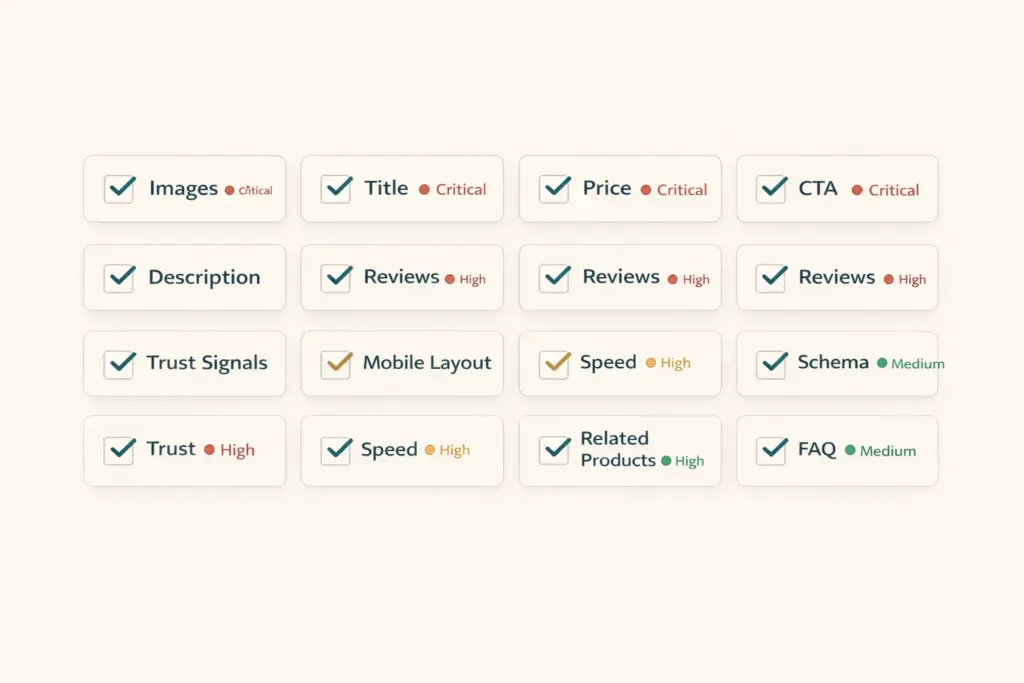
Product Page Optimization Checklist
| Element | Standard | Priority |
|---|---|---|
| Product images | 5-8 images, 1000px+ min, WebP format | Critical |
| Product title | Brand + type + differentiator, keyword-rich | Critical |
| Price visibility | Within 200px of CTA, includes shipping info | Critical |
| CTA button | High contrast, above fold, 48px+ tap target | Critical |
| Description | Benefits-first, 150-300 words, scannable | High |
| Reviews display | Star summary + full section, photo reviews | High |
| Trust signals | Returns, security, shipping guarantee near CTA | High |
| Mobile layout | Sticky CTA, swipe images, collapsible sections | Critical |
| Page speed | Under 3 seconds load on mobile | High |
| Schema markup | Product + Offer + AggregateRating | Medium |
| Related products | 4-8 complementary items below fold | Medium |
| FAQ section | 3-5 common product questions answered | Medium |
Run through this checklist for your top 10 products first (highest traffic, highest revenue potential). Then apply the template to your full catalog. The tools guide covers apps for A/B testing, heatmaps, and session recordings that help you identify which elements need improvement on your specific pages. For the technical SEO side of product pages, our technical SEO checklist covers schema markup and page speed optimization.
Common Product Page Mistakes
One product image. A single photo leaves too many visual questions unanswered. The minimum is five. More images always correlates with higher conversion.
Feature-dump descriptions. “100% organic cotton, 180 GSM, preshrunk, enzyme-washed” means nothing to most buyers. Translate every feature into a benefit: “Stays soft and holds its shape through 50+ washes because we use 180 GSM preshrunk organic cotton.”
Hiding shipping costs. Displaying “$19.99” on the product page then revealing “$7.99 shipping” at checkout is the most common cause of cart abandonment. Show total cost upfront. Better yet, build shipping into the product price and offer “free shipping.”
No urgency or scarcity signals. “Only 3 left in stock” and “Sale ends Sunday” are legitimate urgency signals when truthful. They give fence-sitters a reason to buy now rather than bookmarking and forgetting.
Ignoring mobile checkout flow. Test your entire purchase flow on a real phone. Tiny variant selectors, auto-zooming input fields, and multi-page checkouts kill mobile conversion. Your ecommerce platform should handle mobile checkout well natively, but verify it yourself.
Frequently Asked Questions
The seven essential elements: high-quality images (5-8 per product), benefit-driven description, clear pricing with shipping info, prominent CTA button above the fold, customer reviews with star ratings, trust signals (returns policy, security badges), and a mobile-first layout with sticky Add to Cart. These seven elements account for the majority of conversion impact.
Minimum five images, ideally seven to eight: hero shot on white background, multiple angles, scale reference, lifestyle image in context, detail/texture close-ups, and infographic highlighting features. More images consistently correlate with higher conversion rates because they reduce uncertainty about what the customer is buying.
High converting product pages share these traits: the product, price, and buy button are visible without scrolling; descriptions lead with benefits not features; shipping costs are transparent upfront; customer reviews provide social proof; trust signals reduce purchase anxiety; and the page loads in under 3 seconds on mobile. Top-performing pages convert at 5-8% versus the 2-3% average.
The highest-impact practices: add a sticky CTA bar on mobile (lifts conversion 5-10%), display shipping cost or free shipping messaging on the product page (reduces cart abandonment by up to 48%), show photo reviews from real customers, add urgency signals when truthful (“Only 5 left”), and include a product FAQ section addressing common objections directly on the page.
On desktop: image gallery left (50-60% width), product info right (title, price, variants, CTA, trust signals). On mobile: full-width image carousel, then title, price, CTA, and collapsible description sections. The image occupies the most visual space because it’s the primary decision driver. CTA button must be visible without scrolling on both layouts.
Mobile product page optimization: full-width swipeable image gallery, sticky Add to Cart bar that stays visible while scrolling, large tap targets for variant selectors (48px minimum), collapsible description and specs sections, fast page load (under 3 seconds), and simplified checkout with minimal form fields. Test on real devices, not just browser emulators.
Related Reads
- Ecommerce Web Design Guide
- Category Page Design and SEO
- Technical SEO Audit Checklist
- Ecommerce Tools and Tech Stack
- Ecommerce Storefront Launch Checklist
- Customer Retention Strategies
Enjoying this? Get more like it every week.
One email per week with ecommerce strategies, tool picks, and seller insights. No spam.