
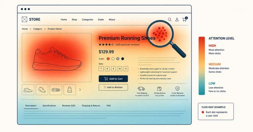
- Heatmap analysis visualizes where visitors click, how far they scroll, and where their attention concentrates on your ecommerce pages. While analytics tools tell you what happened (bounce rate, exit rate), heatmaps show you why it happened by revealing the behavioral patterns behind the numbers.
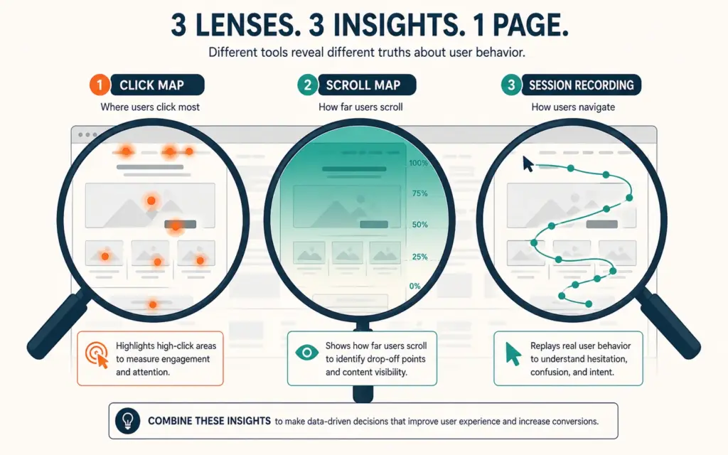
- Three heatmap types serve different diagnostic purposes: click maps reveal which elements visitors interact with (and which they ignore), scroll maps show how far down the page visitors read before leaving, and session recordings replay individual visitor journeys frame-by-frame to expose friction points.
- The highest-ROI heatmap analysis targets 4 pages: homepage (first impression diagnostics), top product page (purchase decision friction), cart page (abandonment causes), and checkout page (completion barriers). Fixing issues found on these 4 pages alone can lift sitewide conversion 10 to 25%.
- Heatmaps are diagnostic tools, not solutions. A heatmap that shows 70% of visitors never scroll past the fold tells you there's a problem but not the fix. Pair heatmap findings with A/B testing to validate that your proposed fix actually improves conversion.
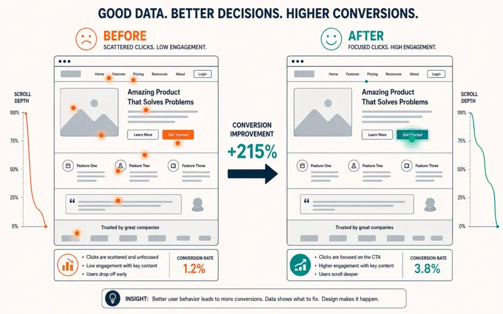
Heatmap analysis turns invisible visitor behavior into visible patterns you can act on. Your analytics dashboard says 68% of product page visitors leave without adding to cart. That number tells you the outcome but nothing about the cause. A heatmap of the same page reveals that most visitors click the product image expecting a zoom that doesn’t exist, that 60% never scroll to see your size guide, and that nobody clicks the “Add to Cart” button because it blends into the background color. Now you know exactly what to fix. According to Hotjar’s conversion research, ecommerce stores that implement heatmap-informed changes improve conversion rates 10 to 25% on optimized pages because they’re fixing real friction points rather than guessing at solutions.
The power of heatmaps is making abstract data visceral. A red cluster of clicks on a non-clickable element isn’t just a data point; it’s hundreds of frustrated visitors trying to interact with something your site won’t let them interact with. Each of those frustrated clicks is a potential customer whose purchase intent your page design wasted.
The Three Heatmap Types and When to Use Each
Click maps (where visitors tap and click)
Click maps overlay colored dots or heat zones on your page showing exactly where visitors click. Hot zones (red/orange) indicate heavy interaction. Cold zones (blue/no color) indicate elements visitors ignore.
What click maps diagnose on ecommerce sites:
- Rage clicks: Repeated rapid clicks on the same element signal frustration. Common on non-clickable images (visitors expect zoom), text that looks like a link but isn’t, and buttons that don’t respond fast enough.
- Ghost clicks: Clicks on non-interactive elements (headings, decorative images, static text). These reveal what visitors expect to be clickable based on visual design cues. If 15% of clicks land on a product feature icon that isn’t linked, visitors want more detail on that feature.
- Ignored CTAs: If your “Add to Cart” button shows minimal click activity despite high page traffic, the button’s position, color, size, or surrounding content is failing to drive action. The product page layout determines whether the CTA earns attention or gets lost.
- Navigation patterns: Which menu items get clicked most (keep and emphasize) and which get clicked least (consolidate or remove). Navigation simplification based on click data reduces choice overload and improves path-to-purchase efficiency.
Scroll maps (how far visitors read)
Scroll maps show the percentage of visitors who reach each depth of the page. The top of the page is always 100% visibility. Typical ecommerce product pages see 40 to 60% of visitors reaching the midpoint and only 15 to 25% reaching the bottom.
Scroll map insights for ecommerce:
- Content priority validation: If only 30% of visitors scroll past the third section, anything below that point is effectively invisible to 70% of your audience. Place your strongest conversion elements (social proof, key benefits, CTA) above the scroll drop-off point.
- The “false bottom” problem: A design element that looks like the end of the page (full-width image, horizontal line, large whitespace gap) causes visitors to stop scrolling prematurely. If scroll maps show a sudden drop at a specific point, check for visual cues that signal “end of content.”
- FAQ and review placement: If your FAQ section sits at 80% page depth but only 20% of visitors reach it, the FAQ isn’t serving its purpose. Move it higher or make the content accessible earlier through expandable sections. The social proof placement strategy should align with scroll depth data rather than design convention.
Session recordings (watching real visitor journeys)
Session recordings replay individual visitor sessions frame-by-frame: every mouse movement, scroll, click, hesitation, and exit. Watching 20 to 30 recordings reveals patterns that aggregate data obscures.
What session recordings reveal:
- Form friction: Visitors filling out checkout fields, pausing at a confusing label, typing and deleting, or abandoning mid-form. Each hesitation point is a potential fix. The checkout flow should be validated through recordings, not just completion rate metrics.
- Comparison shopping behavior: Visitors opening multiple product tabs, toggling between variants, or scrolling between product description and reviews repeatedly. This pattern reveals information gaps that force visitors to work harder than necessary to make a decision.
- Mobile-specific friction: Buttons too small to tap accurately, horizontal scrolling caused by elements overflowing the viewport, pop-ups that cover the full screen without a visible close button. Mobile recordings are essential because 60 to 75% of ecommerce traffic is mobile, and desktop testing misses mobile-specific issues entirely. Research from Microsoft Clarity’s analytics team confirms that mobile session recordings reveal 3 to 5x more usability friction than desktop recordings for the same site, making mobile-first analysis non-negotiable for conversion optimization.
The 4-Page Diagnostic Priority
You could heatmap every page on your site, but the ROI concentrates on four pages that collectively determine 80%+ of your conversion funnel performance.
Page 1: Homepage
Diagnostic questions: Where do visitors click first? Do they find the navigation categories that lead to products? Does the hero section communicate value or just look pretty? What percentage scroll past the fold? High homepage bounce rates combined with click map data showing confusion about where to go next indicate a navigation and messaging problem, not a traffic problem.
Page 2: Top-selling product page
Your highest-traffic product page has the most improvement potential because changes affect the most visitors. Diagnostic questions: Do visitors engage with images (click to zoom, swipe through gallery)? Does the scroll map confirm visitors see the price, key benefits, and Add to Cart button? Are review sections visible to enough visitors? Every 1% conversion improvement on your top product page produces more revenue than 5% improvement on a low-traffic page. Prioritize accordingly.
Page 3: Cart page
Cart abandonment averages 70% across ecommerce. Heatmap and session recording analysis on the cart page reveals why visitors abandon after adding items. Common findings: surprise shipping costs (visible in scroll behavior pausing at the total), distraction by cross-sell recommendations (clicking away from checkout), coupon code field triggering a search for discounts (opening new tabs), and missing trust signals. Each pattern maps to a specific abandonment prevention tactic.
Page 4: Checkout page
Session recordings on checkout are the most revealing diagnostic available. Watch 20 recordings of visitors who abandoned checkout and categorize the exit point: address form, shipping selection, payment entry, or final review. The step with the highest drop-off gets fixed first. Common issues: mandatory account creation, too many form fields, unclear shipping costs until the last step, and payment methods that don’t match visitor preferences.
Turning Heatmap Data Into Conversion Improvements
The diagnostic-to-action framework
- Observe: Install heatmaps and collect 1,000+ pageviews of data (typically 1 to 2 weeks) before drawing conclusions. Small sample sizes produce misleading patterns.
- Identify: Find the 3 to 5 most significant behavioral patterns. “70% of visitors never see the reviews section” or “40% of clicks land on non-interactive elements” are significant. “2% more clicks on the left image than the right image” is noise.
- Hypothesize: For each pattern, form a specific hypothesis. “Moving the review summary above the fold will increase Add to Cart rate because 70% of visitors currently never see the reviews.”
- Test: Implement the change as an A/B test, not a permanent change. Run for 14+ days with statistical significance before declaring a winner. Heatmaps diagnose; A/B tests validate.
- Measure: Track the impact on your core conversion metrics: conversion rate, revenue per visitor, and average order value. A heatmap-informed change that lifts clicks but doesn’t lift revenue isn’t actually an improvement.
5 common heatmap findings and their fixes
Finding: Visitors click product images but nothing happens. Fix: Add image zoom on click/hover and ensure the gallery is swipeable on mobile. Image interaction is the most common click behavior on product pages.
Finding: Nobody scrolls to the product specifications. Fix: Add a sticky “Jump to specs” anchor link visible above the fold, or move key specifications into an expandable section within the first viewport. Don’t bury essential purchase information below the scroll cliff.
Finding: Cart page coupon code field gets more clicks than the checkout button. Fix: Minimize the coupon field (collapsed by default, small “Have a code?” link) or auto-apply available promotions to remove the incentive to leave the cart searching for codes. This single change reduces coupon-driven cart abandonment 5 to 12%.
Finding: Mobile visitors tap the wrong buttons because they’re too close together. Fix: Increase button spacing to 44px minimum (Apple’s recommended touch target) and increase button height to 48px minimum. Mobile tap accuracy drops dramatically below these dimensions.
Finding: Homepage visitors click the hero image expecting it to link somewhere, but it doesn’t. Fix: Make the hero image link to the featured collection or product it showcases. An unlinked hero image wastes the highest-engagement click opportunity on the page. The product detail approach should carry through from hero image to the destination page for messaging consistency.
Heatmap Tools Compared
| Tool | Heatmaps | Recordings | Free Tier | Paid Plans |
|---|---|---|---|---|
| Hotjar | Click, scroll, move | Yes | 35 sessions/day | $32+/month |
| Microsoft Clarity | Click, scroll | Yes | Unlimited (free) | Free |
| Lucky Orange | Click, scroll, move | Yes | Limited | $32+/month |
| Mouseflow | Click, scroll, move, attention | Yes | 500 recordings/month | $31+/month |
| FullStory | Click, rage clicks | Yes | Limited | Custom pricing |
Start with Microsoft Clarity (completely free, unlimited recordings) to validate whether heatmap analysis produces actionable insights for your store. Upgrade to Hotjar or Lucky Orange when you need advanced features like feedback polls, funnel analysis, or integrations with your existing tool stack.
Frequently Asked Questions
Heatmap analysis visualizes where visitors click, how far they scroll, and where attention concentrates on your pages. Three types serve different purposes: click maps show interaction patterns, scroll maps show reading depth, and session recordings replay individual visitor journeys. Together they reveal why visitors behave the way analytics numbers describe, enabling targeted fixes that improve conversion 10 to 25% on optimized pages.
Microsoft Clarity is the best starting point because it’s completely free with unlimited recordings, click maps, and scroll maps. Hotjar ($32+/month) adds feedback polls, user surveys, and more polished dashboards. Lucky Orange ($32+/month) offers real-time visitor monitoring. Start with Clarity to validate the approach, then upgrade when you need advanced features. All major tools integrate with Shopify and WooCommerce via simple script installation.
Collect at least 1,000 pageviews per page before drawing conclusions. Below this threshold, individual visitor behavior creates misleading hot spots that don’t represent actual patterns. For high-traffic pages (homepage, top products), this takes 1 to 3 days. For lower-traffic pages, allow 1 to 2 weeks. Session recordings are useful in smaller quantities: watching 20 to 30 recordings on a specific page usually reveals the dominant friction patterns.
Four pages in priority order: homepage (first impression and navigation patterns), top-selling product page (highest traffic means highest improvement potential), cart page (70% average abandonment rate means significant conversion opportunity), and checkout page (session recordings here reveal exact drop-off points). Fixing friction on these four pages alone can lift sitewide conversion 10 to 25% because they control the core purchase funnel.
Modern heatmap tools load asynchronously, meaning they don’t block page rendering. The performance impact is typically 50 to 150 milliseconds of additional load time, imperceptible to visitors. Microsoft Clarity and Hotjar both use lightweight scripts designed to minimize performance impact. If you’re concerned, test page speed (Google PageSpeed Insights) before and after installation to measure the actual difference on your specific site.
No, they serve different purposes. Heatmaps diagnose problems by showing what visitors do. A/B tests validate solutions by measuring whether a change actually improves conversion. The workflow: use heatmaps to identify friction (diagnostic), form a hypothesis about the fix, implement the fix as an A/B test (validation), and measure the conversion impact. Skipping A/B testing means you’re implementing changes based on assumptions about what the heatmap pattern means, which is sometimes wrong.
Related Reads
- Validating Changes with A/B Tests
- Designing Pages That Convert
- Removing Checkout Friction
- Recovering Abandoned Carts
- Placing Social Proof Strategically
- Measuring Conversion Impact
Enjoying this? Get more like it every week.
One email per week with ecommerce strategies, tool picks, and seller insights. No spam.