
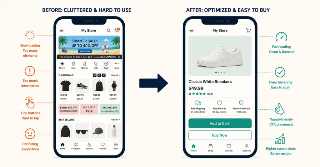
- Mobile accounts for 60 to 75% of ecommerce traffic but converts at roughly half the desktop rate (1.5 to 2% mobile vs 3 to 4% desktop). This gap represents the largest single conversion opportunity for most stores. A store with 100,000 monthly mobile visitors converting at 1.5% instead of 3% loses 1,500 orders per month to mobile friction.
- The three biggest mobile conversion killers: slow page load (53% of mobile visitors leave if a page takes longer than 3 seconds), difficult form completion (typing addresses and card numbers on a small screen), and tap targets that are too small or too close together (causing mis-taps and frustration).
- Express checkout (Apple Pay, Google Pay, Shop Pay) is the single highest-impact mobile CRO fix because it eliminates form completion entirely. Mobile stores with express checkout enabled report 50 to 70% higher mobile conversion than those requiring full form entry.
- Mobile CRO isn't about making the desktop site responsive. It's about designing mobile-first: thumb-zone placement of CTAs, single-column layouts, collapsible content sections, sticky add-to-cart bars, and page speed under 2.5 seconds. The mobile experience should feel native, not adapted.
Mobile CRO (mobile conversion rate optimization) addresses the persistent gap between mobile traffic volume and mobile revenue contribution. Most ecommerce stores receive 60 to 75% of traffic from mobile devices but generate only 40 to 55% of revenue from mobile, because mobile conversion rates average 1.5 to 2% compared to desktop’s 3 to 4%. According to Statista’s device-level ecommerce data, this mobile conversion gap has remained stubbornly consistent even as responsive design became standard, because the problem isn’t layout adaptation; it’s interaction design, speed, and checkout friction.
Closing even half the mobile-desktop conversion gap produces significant revenue. A store with 80,000 monthly mobile visitors at 1.5% conversion ($60 AOV) generates $72,000 from mobile. Improving to 2.25% mobile conversion (half the gap closed) produces $108,000: a $36,000/month revenue increase with zero additional traffic or ad spend. Every checkout optimization improvement and every speed fix compounds on mobile because mobile is where most of your traffic is.
The Three Mobile Conversion Killers
1. Page speed
53% of mobile visitors abandon a site that takes longer than 3 seconds to load. Mobile networks (4G, spotty 5G) add latency that doesn’t exist on desktop broadband. A page that loads in 1.8 seconds on desktop Wi-Fi loads in 3.5 seconds on average mobile connections.
Speed benchmarks for mobile ecommerce: under 2.5 seconds Largest Contentful Paint (LCP) is good, 2.5 to 4 seconds needs improvement, above 4 seconds loses significant traffic before the page renders. Check your current speed with Google PageSpeed Insights using the “Mobile” tab specifically.
Common mobile speed fixes: compress all images to WebP format under 100KB (the single largest speed gain for most stores), defer non-critical JavaScript (analytics, chat widgets, recommendation scripts) until after initial page render, enable browser caching, and minimize third-party app scripts. Each unnecessary Shopify app adds 50 to 200ms to mobile load time. The ecommerce tools and tech stack audit should flag apps that add disproportionate load time relative to their revenue contribution.
2. Form completion friction
Typing a 16-digit credit card number, billing address, shipping address, and email on a 5-inch touchscreen keyboard is the primary reason mobile checkout converts at half the desktop rate. Every additional form field reduces mobile completion by 5 to 10%. A checkout with 15 fields converts dramatically worse on mobile than one with 7 fields, even though the same checkout performs acceptably on desktop where keyboard and autofill work reliably.
Solutions: express checkout (Apple Pay, Google Pay, Shop Pay) eliminates forms entirely. Guest checkout removes the account creation fields. Address autocomplete (Google Places API) reduces address entry to selecting from suggestions. Auto-advancing between fields (card number to expiry to CVV) reduces tap count. The payment methods strategy directly impacts mobile form friction: every express payment option enabled is a mobile conversion improvement.
3. Tap target problems
Buttons smaller than 44×44 pixels cause mis-taps. Links spaced closer than 8 pixels apart cause wrong-link taps. Both create frustration that compounds through the purchase flow. A shopper who mis-taps three times on a product page is more likely to leave than persist. Google’s Core Web Vitals measure this as Interaction to Next Paint (INP): how quickly the page responds to taps. Target under 200ms for good mobile interactivity.
Audit: tap every button, link, and interactive element on your store using your actual phone (not browser dev tools). If your thumb hits the wrong element more than once, redesign that section. The heatmap analysis tools (Hotjar, Microsoft Clarity) show mobile tap patterns and “rage taps” (rapid repeated taps indicating frustration) that reveal exactly where mobile UX breaks.
Mobile-First Design Principles
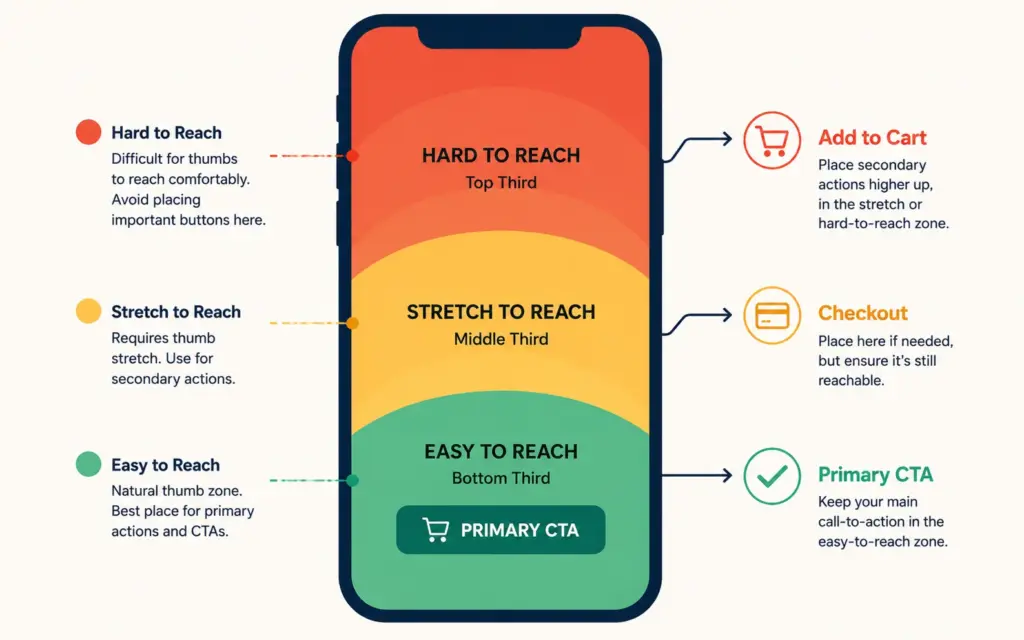
Thumb-zone placement
75% of mobile interactions use a single thumb. The comfortable reach zone is the bottom two-thirds of the screen. Primary CTAs (“Add to Cart,” “Buy Now,” “Checkout”) should be in this zone or use a sticky bottom bar that stays within thumb reach during scrolling. Placing the primary CTA in the top third of a mobile page forces the user to reach uncomfortably or shift their grip, adding friction to every interaction.
Sticky add-to-cart bar
On product pages, implement a sticky bar at the bottom of the screen that appears when the user scrolls past the main add-to-cart button. The bar shows product name, price, and an “Add to Cart” button that’s always within thumb reach. This ensures the purchase action is accessible regardless of scroll position on long product pages with detailed descriptions and reviews. Stores implementing sticky mobile CTAs report 5 to 12% lift in mobile add-to-cart rate.
Collapsible content sections
Product descriptions, specifications, shipping info, and reviews should use accordion/collapsible sections on mobile. This prevents the “infinite scroll” problem where the CTA disappears behind 2,000 words of content. Shoppers expand sections they care about; everything else stays collapsed. Quality product descriptions content remains identical to desktop; only the presentation adapts to mobile’s vertical constraint.
Single-column layouts
Multi-column layouts that work on desktop (product grid with 4 items per row) should reduce to 2 columns maximum on mobile, ideally single-column for product pages and checkout. Each column reduction increases element size, improving readability and tap accuracy. Product grids work at 2 columns; product pages and checkout should be strictly single-column.
Mobile Checkout Optimization
Enable express checkout on product pages, not just at checkout. Apple Pay and Google Pay buttons on the product page create a one-tap purchase path: product page to order confirmation in under 10 seconds. This bypasses the cart entirely for impulse purchases and eliminates every friction point between interest and purchase.
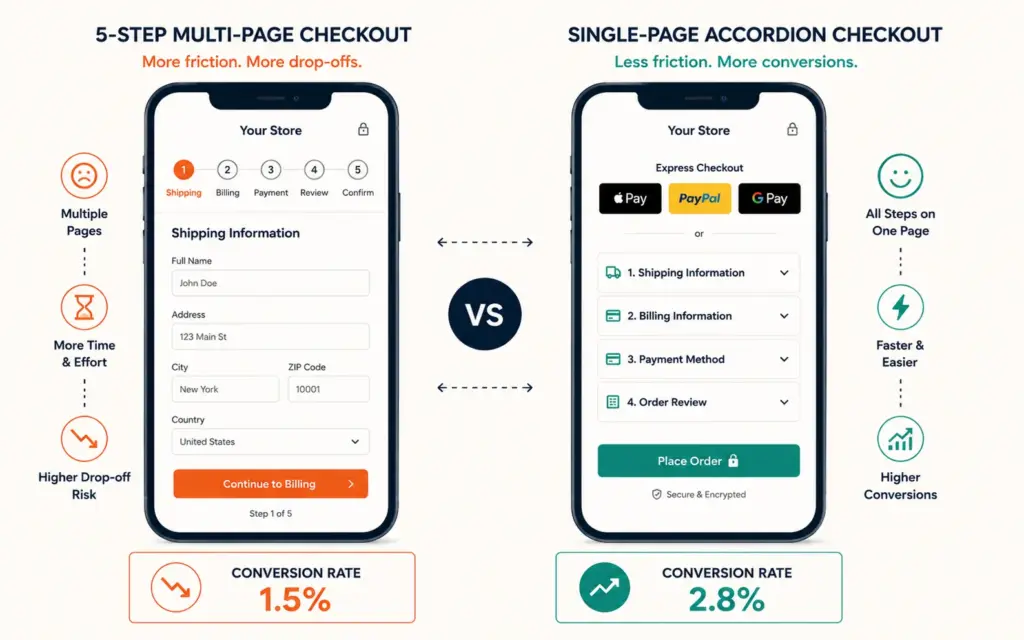
Reduce checkout to a single page. Multi-step checkout (shipping > billing > payment > review > confirm) that requires 4 to 5 page loads is a mobile conversion killer. Single-page checkout with accordion sections (tap to expand shipping, then payment, then review) keeps everything on one screen. Shopify’s checkout is inherently multi-step, but Shopify Plus allows one-page checkout customization.
Use numeric keyboards for appropriate fields. Phone number, zip code, and credit card fields should trigger the numeric keyboard (inputmode=”numeric” attribute) instead of the full QWERTY keyboard. This reduces entry errors and speeds up form completion. A small technical detail that noticeably improves mobile checkout flow.
Show order summary inline, not on a separate page. Mobile shoppers want to verify their cart contents (product, quantity, total) while entering payment information, not navigate to a separate page. Collapsible order summary at the top of checkout serves both purposes. The checkout optimization flow design should prioritize reducing total page loads on mobile even more aggressively than on desktop.
Mobile Product Page Optimization
Image gallery: swipe-native. Product images should use horizontal swipe navigation, not thumbnails. Thumbnails are too small to tap accurately on mobile. Swipe feels native to the device and lets shoppers browse 5 to 10 product images effortlessly. Pinch-to-zoom should be enabled on all product images; 42% of mobile shoppers zoom at least one product image. The product photography quality is even more critical on mobile’s smaller screen where details are harder to distinguish.
Price and CTA above the fold. Product name, price, and “Add to Cart” should all be visible without scrolling on a standard mobile screen (375 to 414 pixel width). If the shopper has to scroll to find the price or purchase button, conversion drops 15 to 20% versus having both immediately visible.
Review summary above the fold, full reviews collapsible. Show the star rating, review count, and one featured review quote above the fold. Full reviews expand via accordion below. The reviews and social proof placement is particularly impactful on mobile where scroll depth is lower and every above-fold element earns disproportionate attention.
Mobile Page Speed Optimization
Specific speed tactics for mobile that go beyond general page speed optimization:
- Lazy-load images below the fold. Load the hero image and first product image immediately. Load all other images (gallery, reviews, recommendations) only when the user scrolls toward them. This reduces initial page weight by 40 to 60% on image-heavy product pages.
- Preconnect to critical third-party domains. If your site loads resources from CDNs, payment processors, or analytics services, add preconnect hints in the HTML head to eliminate DNS lookup delays on mobile networks.
- Minimize JavaScript execution. Mobile processors are 2 to 4x slower than desktop processors. Heavy JavaScript that runs fine on desktop can freeze a mobile browser for 1 to 3 seconds. Audit your JavaScript bundles and remove unused code from apps you’ve uninstalled (Shopify themes often retain dead JavaScript from previously removed apps).
- Use a CDN. Content delivery networks serve images and assets from servers geographically close to the visitor. Shopify includes a CDN by default. WooCommerce stores should use Cloudflare or a similar CDN to reduce mobile latency globally. According to Google’s web performance guidelines, CDN usage reduces mobile page load time by 30 to 50% for geographically distributed visitors.
Testing Mobile CRO Changes
Every mobile change should be tested against the mobile-specific conversion rate, not the blended site conversion rate. The A/B testing ecommerce setup should segment mobile and desktop results separately because a change that improves mobile conversion might hurt desktop (or vice versa). Run mobile-only experiments when possible. The email marketing strategy should also account for mobile: 60 to 70% of marketing emails are opened on mobile, making email CTA design a mobile-first task. Additionally, the tracking setup should segment mobile and desktop conversion data so you can measure mobile CRO improvements in isolation. Understanding your ecommerce pricing strategy display on mobile matters too: price visibility above the fold on small screens directly impacts purchase decisions.
The ecommerce profit margins improve directly when mobile conversion lifts because mobile traffic is free once acquired organically. Priority testing order for maximum impact: (1) express checkout enablement, (2) page speed improvements, (3) sticky CTA implementation, (4) form field reduction, (5) image optimization and gallery changes. Test in this order because each subsequent change builds on the conversion foundation established by the previous one.
Frequently Asked Questions
Average mobile ecommerce conversion rate is 1.5 to 2%. Well-optimized stores achieve 2.5 to 3.5% on mobile. Above 3% puts you in the top 20% of mobile performance. Compare your mobile conversion rate against your desktop rate to identify the gap: the industry average gap is 1.5 to 2 percentage points. Closing half that gap typically represents the largest single revenue opportunity for most stores.
Enabling express checkout (Apple Pay, Google Pay, Shop Pay) on product pages. Express checkout eliminates form completion entirely, the primary mobile conversion killer. Mobile stores with express checkout report 50 to 70% higher conversion than those requiring full form entry. It’s also the fastest to implement: a toggle in your platform settings, requiring no design or development work.
Under 2.5 seconds Largest Contentful Paint (LCP) is good. 2.5 to 4 seconds needs improvement. Above 4 seconds loses significant traffic before content renders. 53% of mobile visitors leave if a page takes longer than 3 seconds. Check your current speed using Google PageSpeed Insights, specifically the Mobile tab. The biggest speed gains come from image compression (WebP under 100KB) and deferring non-critical JavaScript.
Mobile-first. When 60 to 75% of your traffic is mobile, designing for mobile first ensures the majority experience is optimized, with desktop as the enhanced version. Desktop-first designs that are “made responsive” for mobile always carry compromises: elements that work at 1200 pixels wide but feel cramped at 375 pixels. Mobile-first forces constraint-based design decisions that improve both experiences.
Thumb-zone design places primary interactive elements (buttons, navigation, CTAs) within the area of the screen that a single thumb can comfortably reach. This is the bottom two-thirds of the screen for most phone sizes. Placing “Add to Cart” or “Checkout” buttons in the thumb zone (or using a sticky bottom bar) reduces the physical effort of tapping the purchase action, which directly correlates with conversion rate improvement of 5 to 12%.
Use your actual phone, not browser responsive mode. Complete a full purchase flow: browse products, add to cart, begin checkout, enter payment, confirm order. Tap every button and link. Note any difficulty: text too small to read, buttons too small to tap, images that don’t load, or forms that are difficult to complete. Browser dev tools don’t replicate actual mobile performance (processing speed, network latency, touch precision), making real-device testing essential.
Related Reads
- Checkout Optimization
- Payment Methods
- Heatmap Analysis
- Product Descriptions
- A/B Testing Ecommerce
- Ecommerce Tools and Tech Stack
Enjoying this? Get more like it every week.
One email per week with ecommerce strategies, tool picks, and seller insights. No spam.