

- An ecommerce dashboard is one screen that pulls sales, marketing, fulfillment, and customer data into the same place, so instead of bouncing between your store admin, Google Analytics, ad managers, and ops tools, you look at one view. Simple concept, surprisingly hard to get right. The goal is a dashboard that tells you what to do next, not just what happened.
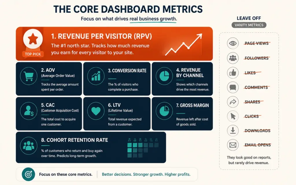
- The biggest mistake is tracking too many vanity metrics. A metric is just a number; a KPI is a metric tied to a strategic outcome. Page views and follower counts feel good but drive poor decisions. Focus on metrics that change when your business genuinely improves: Revenue per Visitor, customer lifetime value, and cohort retention.
- The rule of thumb: about 15 metrics, not 50. If a new team member can't make sense of your dashboard in 30 seconds, it's too complicated. Revenue per Visitor deserves the top spot, since it rolls conversion rate and average order value into one number tying traffic quality to your bottom line. Round it out with AOV, revenue by channel, CAC, LTV, and gross margin.
- Tool choice depends on your stage: GA4 (free, strong behavior tracking but weak on financial and order-level data), Shopify's built-in analytics for Shopify stores, or dedicated dashboard tools (Databox, Tableau, Power BI, or ecommerce-specific platforms) that unify data from multiple sources into one filterable view as you scale.
This ecommerce dashboard guide is about building one screen that actually helps you run your store. Strip away the marketing language and an ecommerce dashboard is simple: it pulls sales, marketing, fulfillment, and customer data into the same place, so instead of bouncing between your store admin, your Google Analytics property, your ad managers, and whatever your ops team uses, you look at one view. That’s the whole idea. It’s a simple concept that’s surprisingly hard to get right, because the temptation is always to add more metrics until the dashboard becomes a wall of numbers nobody acts on. The best dashboards resist that pull and stay deliberately sparse.
The dashboards that actually drive growth share a discipline: they show the few metrics that matter, tied to decisions, in a way anyone on the team can read at a glance. The goal isn’t a dashboard that tells you what happened last month; it’s one that tells you what’s happening now and what to do about it. A modern real-time dashboard draws data across Shopify, Google Analytics, ad platforms, email tools, and inventory systems into a single filterable view, so the whole picture lives on one screen instead of being scattered across a dozen tabs. This guide covers the metrics that belong on your dashboard, how to avoid the vanity-metric trap, the leading tools, and how to build a dashboard that drives decisions. The ecommerce KPIs guide covers the metrics themselves in depth; this covers assembling them into a dashboard you’ll actually use, which is a different skill: knowing which metrics to leave off matters as much as knowing which to include.
The Vanity Metric Trap That Sinks Dashboards
The single biggest mistake in ecommerce dashboards is tracking too many vanity metrics. According to Digital Applied’s analytics guide, vanity metrics like total page views and social follower counts feel good but drive poor decisions, while the metrics that matter are the ones that change when your business genuinely improves: Revenue per Visitor, customer lifetime value, and cohort retention rate.
The distinction is between a metric and a KPI. A metric is just a number. A KPI is a metric tied directly to a strategic outcome. Website traffic and total revenue are useful context, but the KPIs that drive decisions connect an action to a result. When you fill your dashboard with vanity metrics, you feel informed while making worse decisions, because the numbers going up don’t correspond to the business getting healthier. The discipline of a good dashboard is ruthless selection: every metric on it should be one you’d change your behavior based on. A useful test for any metric you’re tempted to add: if this number doubled overnight, would you do anything differently? If the answer is no, it doesn’t belong on your dashboard, however satisfying it is to watch. The data-driven marketing principle applies directly, since a dashboard is the tool that turns data into the decisions data-driven marketing depends on.
The Metrics That Belong on Your Dashboard
The rule of thumb from teams that grow profitably: about 15 metrics, not 50. If a new team member can’t make sense of your dashboard in 30 seconds, it’s too complicated. According to Databrain’s dashboard analysis, Revenue per Visitor deserves the top spot because it rolls conversion rate and average order value into a single number that ties traffic quality directly to your bottom line. If you had to pick one KPI, that’s the one. The core set:
- Revenue per Visitor (RPV): Conversion rate and AOV combined. The single most actionable top-line metric.
- Average Order Value (AOV): Transaction size, the lever behind upsells and bundles.
- Conversion Rate: Purchases divided by visitors. Core funnel health.
- Revenue by Channel: Which sources actually pull their weight, shown as a percentage breakdown.
- Customer Acquisition Cost (CAC): What you spend to acquire a customer.
- Customer Lifetime Value (LTV): Total value a customer generates over time.
- Gross Profit Margin: Revenue left after cost of goods. The metric that separates scaling a smart business from scaling an insolvent one.
- Cohort Retention: Whether retention is improving over time, not just a flat average.
These turn the dashboard from a growth tracker into a business health monitor. Gross margin especially matters: healthy margins run 40 to 60% for physical goods and 60 to 80% for digital goods, and a dashboard that tracks revenue without margin can hide the difference between growing profitably and growing broke. Plenty of stores have scaled revenue impressively while quietly going insolvent because rising ad costs and discounts ate the margin the top-line revenue number never showed. The lifetime value calculation and ROAS benchmarks guides cover two of these metrics in depth, and both belong on a complete dashboard.
Choosing Your Dashboard Tool
| Tool | Best For | Note |
|---|---|---|
| GA4 | Behavior and traffic tracking | Free, weak on financial/order data |
| Shopify Analytics | Shopify stores | Built-in, no setup |
| Databox | Multi-source KPI boards | Popular with agencies |
| Tableau / Power BI | Advanced visualization | Powerful, steeper learning curve |
| Ecommerce-specific platforms | Unified store analytics | Purpose-built for stores |
Tool choice depends on your stage. GA4 is free and strong on event tracking and behavior flow, but it isn’t an ecommerce dashboard out of the box: it needs ecommerce event tagging to support funnel and purchase metrics, and it lacks financial modeling, order-level drill-downs, and attribution accuracy. Most teams use GA4 alongside other tools rather than as their whole dashboard. Shopify’s built-in analytics is the zero-setup starting point for Shopify stores. As you scale, dedicated dashboard tools (Databox for multi-source KPI boards, Tableau or Power BI for advanced visualization, or ecommerce-specific platforms) unify data from your store, ad platforms, email, and inventory into one filterable view. The tracking setup guide covers configuring the underlying tracking that feeds any dashboard, since a dashboard is only as good as the data behind it. The ecommerce tools and tech stack should match your dashboard tool to your data sources and scale.
Building a Dashboard That Drives Decisions
A dashboard isn’t useful until it changes what you do. To build one that drives decisions rather than just reporting:
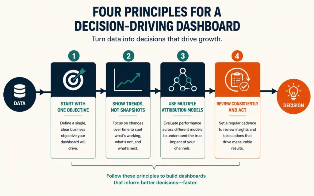
Start with one objective. Pick a single business goal (improve profitability, grow retention, lower CAC), then select the small set of metrics that support it. A dashboard built around an objective is actionable; a dashboard built around “all the metrics” is noise.
Show trends, not just snapshots. A number on its own (“conversion rate: 2.1%”) means little. The same number against last month’s (“2.1%, down from 2.6%”) tells you something’s wrong and prompts action. Dashboards should show direction and change, not static values.
Use multiple attribution models where relevant. Last-click attribution undervalues discovery channels like SEO and social. Running first-touch, last-touch, and data-driven models gives a fuller picture of which channels actually contribute. The attribution modeling guide covers this in depth.
Review consistently and act. A dashboard reviewed weekly and acted on beats a beautiful dashboard nobody opens. Set a rhythm (daily sales check, weekly deeper review, monthly deep dive), and tie each review to specific decisions about where to focus next. The financial planning and scaling process runs on exactly this kind of consistent dashboard review, turning numbers into the decisions that steer the business.
Frequently Asked Questions
About 15 core metrics, not 50. The essential set: Revenue per Visitor (the single most actionable, combining conversion rate and AOV), Average Order Value, Conversion Rate, Revenue by Channel, Customer Acquisition Cost, Customer Lifetime Value, Gross Profit Margin, and Cohort Retention. These turn the dashboard from a growth tracker into a business health monitor. Avoid vanity metrics like total page views and follower counts, which feel good but drive poor decisions. If a new team member can’t make sense of the dashboard in 30 seconds, it has too many metrics.
It depends on your stage. For Shopify stores, the built-in Shopify analytics is a zero-setup starting point. GA4 is free and strong on behavior and traffic tracking but isn’t a full ecommerce dashboard out of the box (it lacks financial modeling and order-level data), so most teams use it alongside other tools. As you scale, dedicated tools unify multiple data sources: Databox for multi-source KPI boards (popular with agencies), Tableau or Power BI for advanced visualization, or ecommerce-specific platforms purpose-built for stores. Match the tool to your data sources and scale.
A metric is just a number (page views, follower count). A KPI is a metric tied directly to a strategic outcome, one you’d change your behavior based on. The distinction matters because filling a dashboard with metrics that don’t connect to decisions makes you feel informed while making worse choices, since the numbers going up don’t mean the business is getting healthier. A good dashboard tracks KPIs (Revenue per Visitor, LTV, cohort retention) that move when your business genuinely improves, not vanity metrics that feel good but drive poor decisions.
Revenue per Visitor (RPV) rolls conversion rate and average order value into a single number that ties traffic quality directly to your bottom line, making it more actionable than either metric alone. If conversion rate rises but AOV falls, or vice versa, RPV captures the net effect on revenue. It answers the question that matters most: how much money does each visitor to your store generate? That’s why it deserves the top spot on an ecommerce dashboard. If you could track only one KPI, RPV would be the one, since it connects the two biggest revenue levers into one clear signal.
Not on its own for most stores. GA4 is free and strong on event tracking and behavior flow, but it isn’t an ecommerce dashboard out of the box: it requires ecommerce event tagging to support funnel and purchase metrics, and it lacks financial modeling, order-level drill-downs, and attribution accuracy. Most teams use GA4 alongside other tools for tracking site behavior and campaign performance, while relying on their store’s analytics or a dedicated dashboard tool for financial and order-level metrics. GA4 covers the behavior side well but needs complementing for a complete dashboard.
Start with one business objective (improve profitability, grow retention, lower CAC), then select only the small set of metrics that support it, rather than tracking everything. Show trends and change, not just static snapshots, since a number means little without context from prior periods. Use multiple attribution models where relevant, since last-click undervalues discovery channels. Most importantly, review the dashboard consistently on a set rhythm and tie each review to actual decisions. A dashboard reviewed weekly and acted on beats a beautiful one nobody opens.
Related Reads
- Ecommerce KPIs
- Data-Driven Marketing
- Attribution Modeling
- Lifetime Value Calculation
- Tracking Setup
- Financial Planning and Scaling
Enjoying this? Get more like it every week.
One email per week with ecommerce strategies, tool picks, and seller insights. No spam.