- 57% of people won't recommend a business with a poorly designed website. Your store's design directly impacts trust, conversions, and revenue.
- Mobile devices account for roughly 78% of retail site visits and 70% of online orders. If your store isn't mobile-first, you're losing the majority of your traffic.
- A 1-second delay in page load time can drop conversions by 7%. Speed isn't a nice-to-have - it's a revenue multiplier.
- The design elements that actually move sales: clear navigation, high-quality product images, visible trust signals, simplified checkout, and fast page speed. Everything else is secondary.
I’ve reviewed hundreds of ecommerce stores, and the pattern is always the same. The sellers obsessing over fonts and color palettes are usually the ones struggling with conversions. The sellers with clean, fast, trustworthy-looking stores are the ones making money.
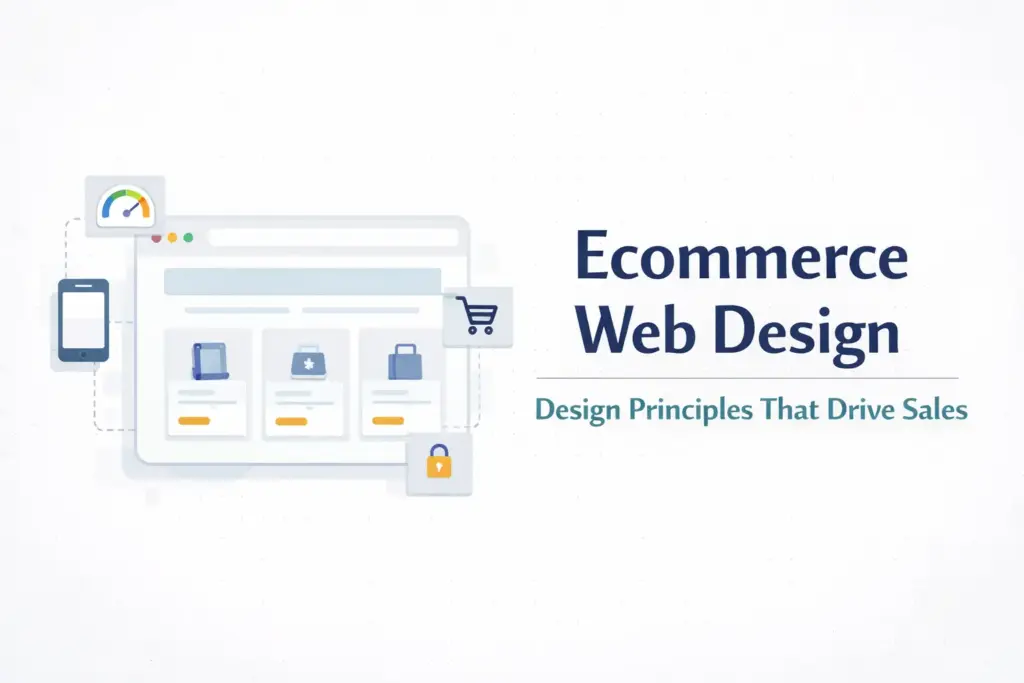
Ecommerce web design is the practice of planning and building an online store’s visual layout, user experience, and technical performance to guide visitors from browsing to buying. It covers everything from homepage structure and navigation to product page layout, mobile responsiveness, checkout flow, and page speed. Good ecommerce design isn’t about winning awards. It’s about removing every possible reason a visitor might leave without buying.
If you’re in the process of launching your ecommerce business, this is where most of your customer’s first impression gets formed. Research from BigCommerce shows that 57% of people won’t recommend a business with a poorly designed website. Your design is your storefront. Make it count.
Design for Conversion, Not Compliments
Here’s the uncomfortable truth about ecommerce design: the stores that convert best are rarely the most visually creative. They’re the most frictionless. Every design decision should answer one question: does this make it easier or harder for someone to buy?
The average ecommerce conversion rate sits around 2-3% globally. That means 97-98 out of every 100 visitors leave without purchasing. Your design’s job is to chip away at that number, not by being flashier, but by being clearer.
These are the design elements that actually impact revenue, ranked by how much they move the needle.
Navigation and Site Structure
If visitors can’t find what they’re looking for within 3-5 seconds, they leave. Navigation is the single most underrated conversion factor in ecommerce design.
Keep your main menu simple. 5-7 top-level categories maximum. If you need more, use a mega menu with subcategories. But the top level should be scannable in a glance. Nobody wants to parse 15 menu items to figure out where “men’s running shoes” lives.
Add a search bar that works. On-site search users convert at 2-3x the rate of browsers. Make the search bar prominent (top-center or top-right), and invest in search that handles typos, synonyms, and partial matches. A customer who searches “blue dress” and gets zero results because your product is tagged “navy dress” is a customer who leaves.
Use breadcrumbs. They help users understand where they are in your store hierarchy and provide easy navigation back to category pages. They also help search engines understand your site structure. Win-win.
Filter and sort on category pages. Price range, size, color, rating, availability. Every filter you add reduces the time between “I’m browsing” and “I found what I want.” The fewer clicks to the right product, the higher the conversion rate.
Product Pages That Sell
Your product page is where the buying decision happens. Every other page on your site exists to get people here. Treat it accordingly.
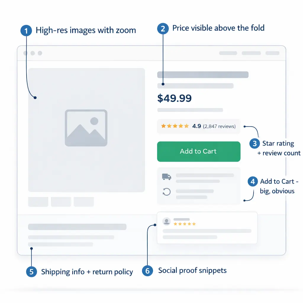
Images are everything. Online shoppers can’t touch your product. Your photos are their hands. Use high-resolution images (zoom-capable), show multiple angles, include lifestyle shots showing the product in use, and add scale reference so people know how big it actually is. Stores with professional product photography consistently outperform those with phone snapshots.
Put the price and CTA above the fold. The “Add to Cart” button and price should be visible without scrolling on both desktop and mobile. If someone has to hunt for how to buy, you’ve already lost them.
Social proof near the buy button. Star rating, review count, and 1-2 snippet reviews should be visible near the CTA. Not buried at the bottom of the page. People want reassurance right at the moment of decision, not after they’ve scrolled past three paragraphs of product description.
Product descriptions that address objections. Don’t just list features. Answer the questions running through a buyer’s head: What’s it made of? How big is it? Will it work for my specific situation? What if I don’t like it? How long does shipping take? Every unanswered question is a reason to close the tab.
Show related and complementary products. “Customers also bought” and “Complete the look” sections increase average order value. Amazon attributes up to 35% of its revenue to recommendation algorithms. You don’t need Amazon-level AI. Even manually curated suggestions help.
Mobile-First Design
This isn’t a “nice to have” section. Mobile devices now account for roughly 78% of retail site visits and generate about 70% of all online shopping orders (Statista, Q3 2025). If your store looks great on desktop and terrible on a phone, you’re designing for the minority of your visitors.
Test on actual phones. Not just Chrome’s responsive view. Load your store on an iPhone and a mid-range Android and actually try to buy something. Is the text readable without zooming? Can you tap buttons without hitting the wrong one? Does the checkout flow work with a thumb?
Simplify navigation for mobile. Hamburger menu is fine. What’s not fine is burying critical links three taps deep. Product categories, search, and cart should be accessible from every screen with one tap.
Make touch targets big enough. Buttons should be at least 44×44 pixels. Links should have enough spacing that fat-fingering doesn’t send someone to the wrong page. This sounds trivial. It’s not. Poor touch targets cause rage taps, bounce-backs, and abandoned sessions.
Optimize forms for mobile. Auto-fill enabled. Numeric keyboard for phone/zip fields. Minimal required fields. Every extra field you add to a mobile checkout form costs you conversions.
Page Speed
A 1-second delay in page load time can drop conversions by 7%. That’s not an opinion. That’s data backed by multiple industry studies from Google and Akamai. If your site takes 5 seconds to load instead of 2, you’re potentially losing 20%+ of your sales before anyone even sees a product.
What actually slows ecommerce sites down:
- Unoptimized images. The #1 culprit. Compress everything to WebP format. Lazy-load images below the fold. A 4MB hero image is never acceptable.
- Too many apps/plugins. Every Shopify app and WordPress plugin adds JavaScript that has to load. Audit regularly. If you installed it six months ago and forgot about it, delete it.
- Cheap hosting. Shared hosting at $3/month will choke under traffic. Invest in proper ecommerce hosting. Cloudways, Kinsta, or Shopify’s built-in hosting are reliable options.
- No caching or CDN. Cloudflare (free tier) dramatically improves global load times. LiteSpeed Cache or WP Rocket for WordPress. These are non-negotiable for any serious store.
Test your site with Google PageSpeed Insights. Aim for a score above 80 on mobile. Anything below 50 is actively costing you money.
Trust Signals and Credibility
Most shoppers don’t consciously think “do I trust this store?” But if trust signals are missing, they feel something’s off and leave. Trust is the invisible design element that separates stores that convert from stores that don’t.
SSL certificate. Non-negotiable. If your URL doesn’t show “https” and the padlock icon, browsers will flag your site as insecure. Most hosting providers include free SSL.
Payment badges. Display accepted payment methods (Visa, Mastercard, PayPal, Apple Pay) in the footer and at checkout. Familiarity breeds trust.
Return and shipping policies visible. Don’t hide these on a buried page. Link them in the footer, on product pages, and during checkout. Clear policies reduce purchase anxiety.
Real contact information. An email address, a phone number, or live chat. Something that says “real humans work here.” A store with no visible contact info feels like a scam to first-time visitors, regardless of how legitimate you are.
Customer reviews. If you have them, show them prominently. If you’re new and don’t have reviews yet, consider importing reviews from a marketplace where you sell (if applicable) or launching with a discounted “founding customer” program to build initial reviews.
Checkout Flow
Cart abandonment rates average around 70% across all industries (Baymard Institute). That means for every 10 people who add something to their cart, 7 leave without paying. Your checkout design is the last barrier between a visitor and a customer.
Offer guest checkout. Forcing account creation before purchase is one of the top reasons for cart abandonment. Let people buy first, then invite them to create an account on the confirmation page.
Minimize steps. One-page checkout converts better than multi-step for most stores. If you must use multiple steps, show a progress indicator so people know how close they are to finishing.
Show the total cost early. Unexpected shipping costs at checkout are the #1 reason for abandonment. Display estimated shipping on the product page or in the cart, not as a surprise at the final step.
Offer multiple payment options. Credit card, PayPal, Apple Pay, Google Pay, and consider Buy Now Pay Later (Klarna, Afterpay) for higher-priced items. Every payment method you don’t offer is a subset of customers you lose.
DIY vs Hiring a Designer
You don’t need a $10,000 custom design to launch. Modern ecommerce platforms come with professional themes that handle 90% of the design work. Here’s how to decide:
DIY makes sense when: You’re starting out with limited budget, you’re using Shopify or a platform with polished themes, your product catalog is under 100 SKUs, and you’re willing to invest a weekend learning the platform’s design tools. Cost: $0-$350 for a premium theme.
Hire a designer when: Your store needs custom functionality, you’re doing $10K+/month and design improvements could yield significant revenue gains, you need custom integrations or a unique brand experience, or you’ve hit a ceiling and can’t figure out why conversions are flat. Cost: $2,000-$15,000+ depending on scope.
For most sellers reading this, start with a premium theme on your chosen platform, focus on the principles above, and reinvest revenue into professional design once you’ve proven the business model. Our ecommerce website templates guide covers the best options by platform.
Frequently Asked Questions
How much does ecommerce web design cost?
DIY with a premium theme: $0-$350. Freelance designer: $1,000-$5,000. Professional agency: $5,000-$50,000+. Most new sellers should start with a premium theme and upgrade later.
What makes a good ecommerce website design?
Fast load times, intuitive navigation, high-quality product images, visible trust signals, mobile-responsive layout, and a simplified checkout flow. Good design removes friction, not adds decoration.
Should I design my store for desktop or mobile first?
Mobile first. Over 78% of ecommerce site visits come from mobile devices. Design for the smallest screen, then scale up to desktop.
Which ecommerce platform has the best design tools?
Shopify offers the best balance of ease-of-use and design flexibility for most sellers. Squarespace has the most visually polished templates. WooCommerce offers the most customization but requires more technical skill.
How do I improve my ecommerce conversion rate through design?
Start with page speed (under 3 seconds), then optimize product pages (better images, clear CTA above the fold, visible reviews), simplify checkout (guest checkout, fewer fields), and add trust signals throughout.
Related reads: Complete Guide to Starting an Ecommerce Business | Store Launch Checklist | Ecommerce Website Templates | Best Ecommerce Platforms Compared | Product Page Design Optimization
Enjoying this? Get more like it every week.
One email per week with ecommerce strategies, tool picks, and seller insights. No spam.